Understanding Quiet Luxury
Try Palette Immo AI Interior Styler
Transform empty rooms and listing photos with AI virtual staging and interior design. Get started in minutes.
Get startedQuiet luxury is a design approach that emphasizes subtlety, sophistication, and an understated elegance. Unlike more vibrant styles, quiet luxury seeks to create an environment that feels serene and effortlessly chic. In the living room, this can be achieved through a carefully curated paint palette that combines muted tones and classic hues.
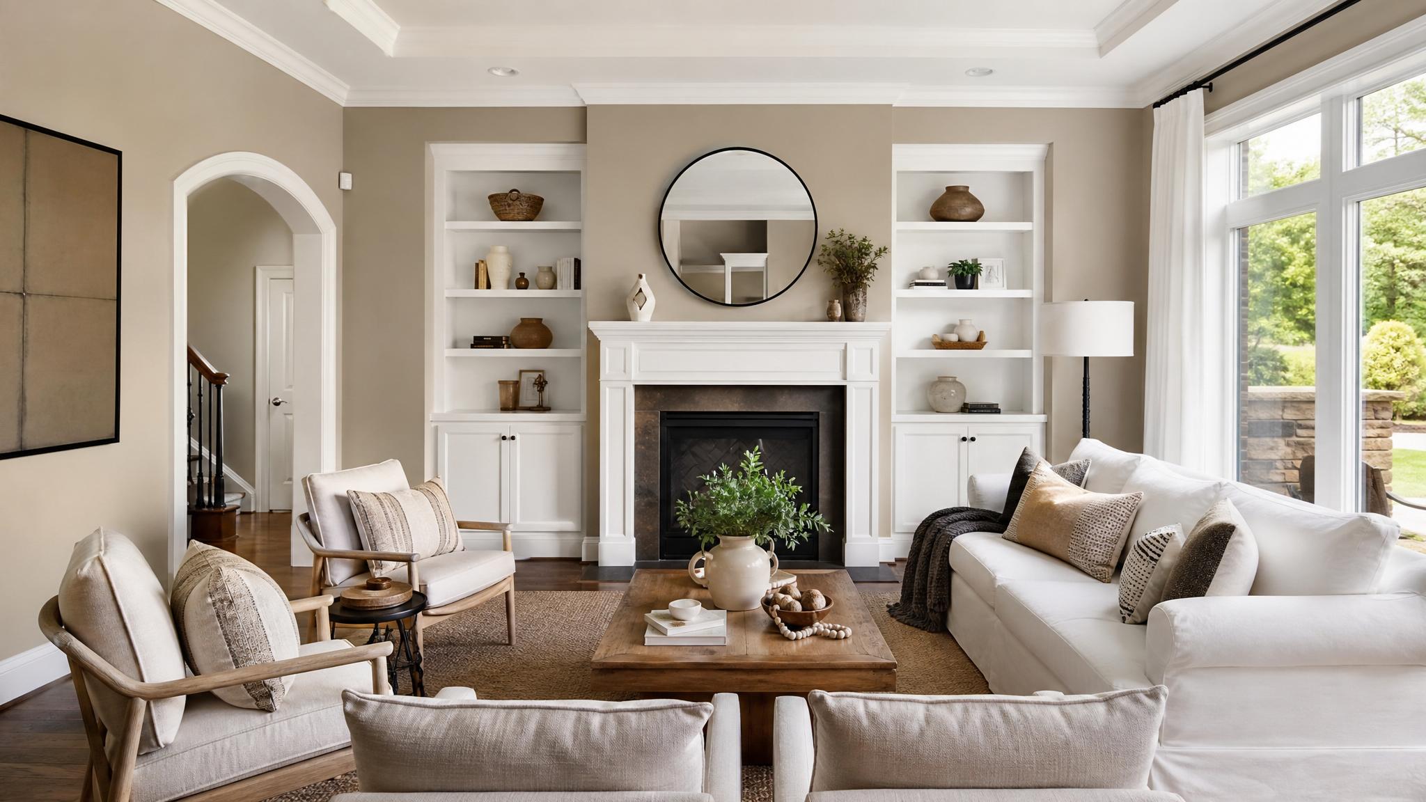
1. Soft Taupe and Whisper White
This combination creates a warm and inviting space. Soft taupe brings depth while whisper white adds brightness, perfect for a serenity-focused living room.
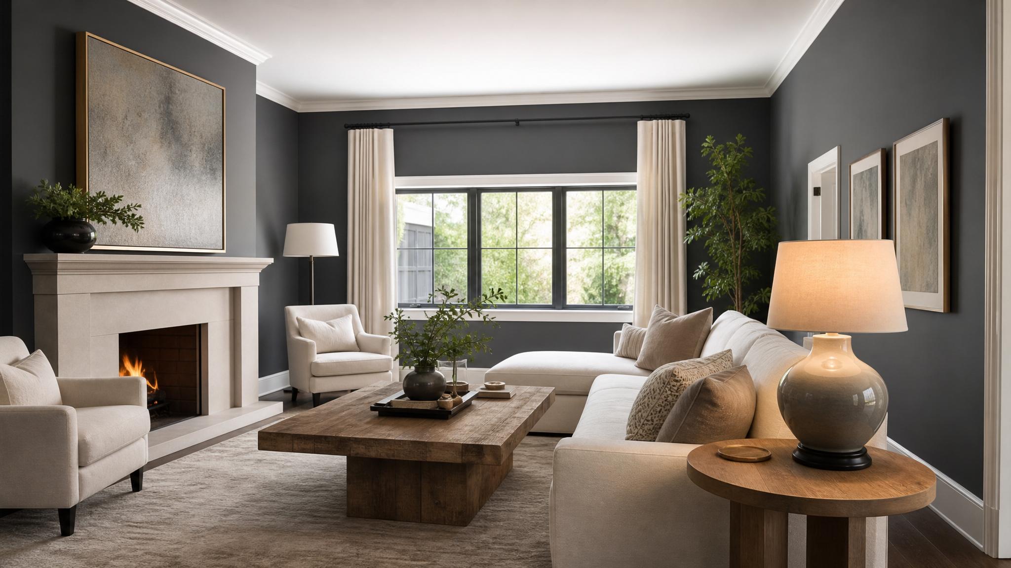
2. Charcoal Grey and Cream
Charcoal grey offers a dramatic contrast that adds sophistication, while cream softens the effect. This balance is ideal for a modern, upscale living area.
3. Sage Green and Light Beige
Sage green evokes a natural calmness and pairs beautifully with light beige, creating an organic and soothing environment. Perfect for those who appreciate earthy tones.
4. Navy Blue and Soft Grey
Navy blue exudes elegance and when paired with soft grey, it creates a professional yet cozy atmosphere. This combination is perfect for formal living rooms.
5. Dusty Rose and Off-White
A gentle dusty rose adds a touch of warmth, while off-white ensures the space remains light and airy. This duo is perfect for a romantic yet modern touch.
6. Pale Blue and Taupe
Pale blue coupled with taupe creates a timeless elegance, reminiscent of coastal retreats. This serene pairing is excellent for promoting relaxation.
7. Soft Lavender and Cream
Soft lavender brings a gentle pop of color, creating a fresh feel against cream. This combination is soothing and inviting, ideal for spaces meant for unwinding.
8. Earthy Brown and Light Sage
This earthy combination enhances a living area’s warmth and comfort, making it feel inviting and homey. Light sage acts as a refreshing element to balance deep brown tones.
9. Slate Blue and Warm White
Slate blue is majestic and resonates with tranquility, while warm white adds a cozy comparison. This family-friendly palette is perfect for spaces where memories are made.
Key takeaway
Choosing the right paint palette for quiet luxury involves understanding the balance between subtle hues and complementary tones. Aim for combinations that evoke calm, warmth, and sophistication.