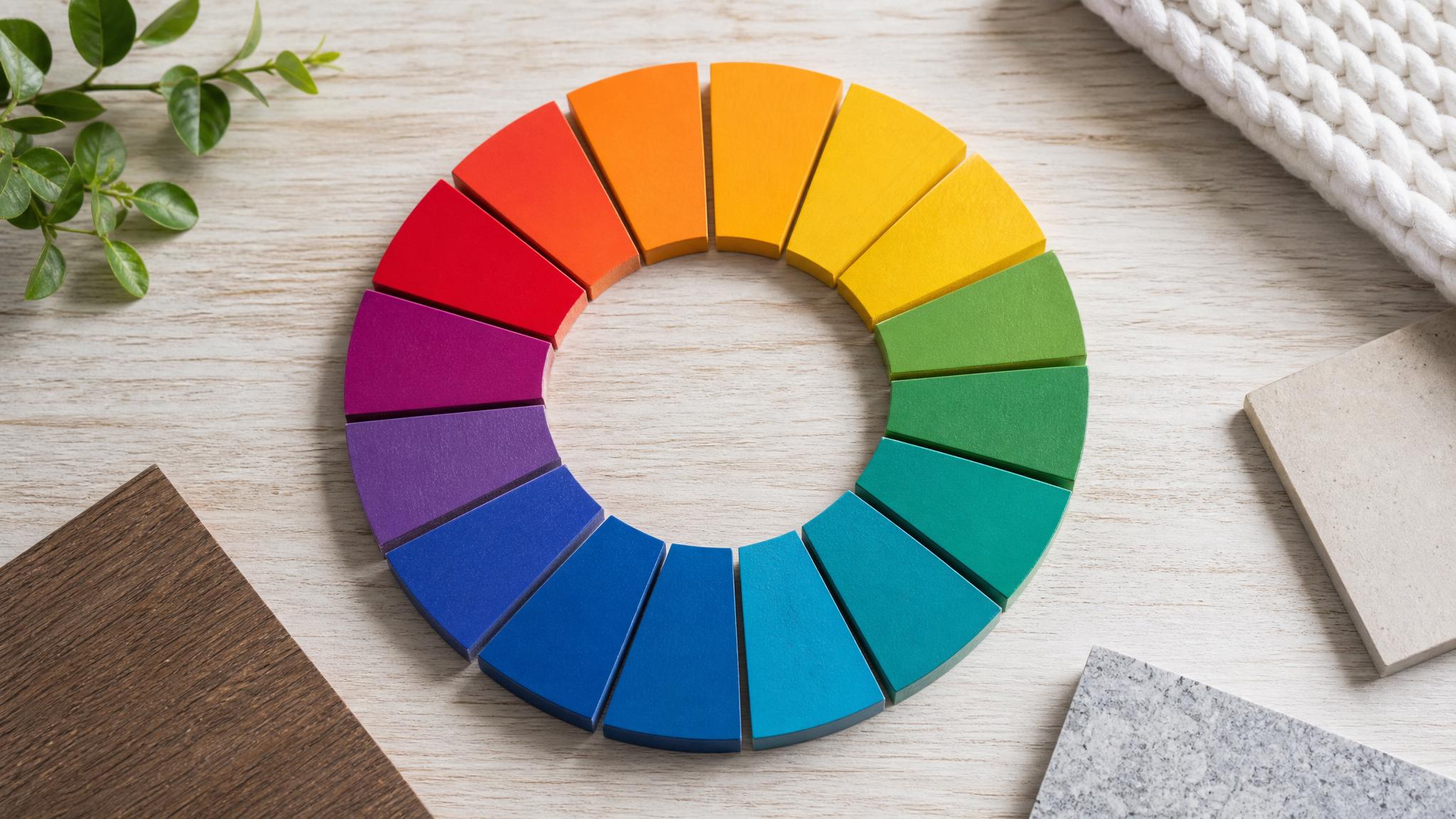
Understanding Color Theory in Interior Design
Try Palette Immo AI Interior Styler
Transform empty rooms and listing photos with AI virtual staging and interior design. Get started in minutes.
Get startedBefore diving into our list of modern color palettes, it's essential to understand the basics of color theory. Color theory is the science and art of using colors in harmony, contrasting, or complementing one another to create a pleasing aesthetic. In interior design, the right color palette can transform a living space, creating an atmosphere that suits your taste and lifestyle.
50 Modern Color Palette Combinations for Your Living Room
Here are 50 modern color combinations that can give your living room a fresh and appealing look:
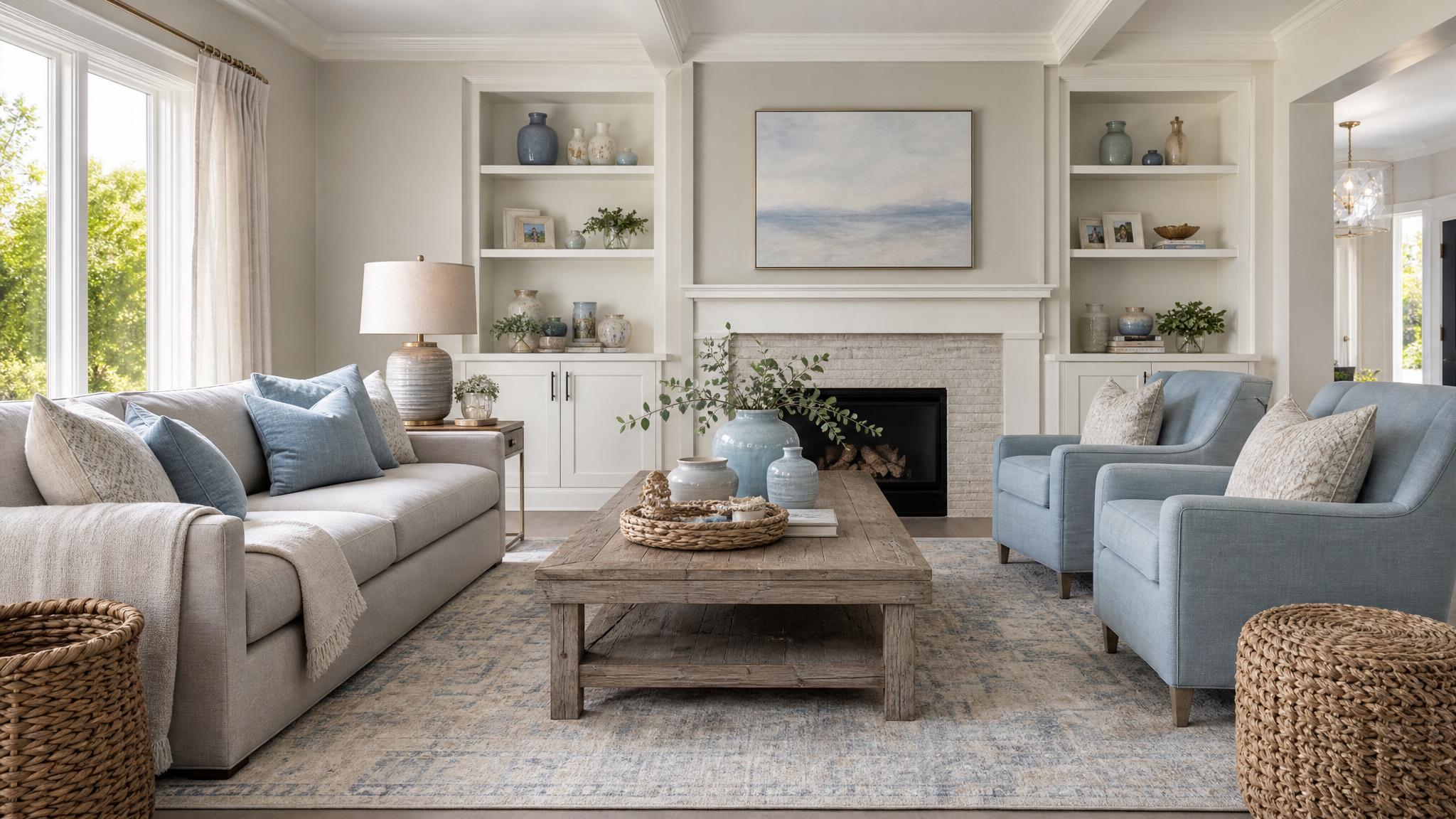
- 1. Soft Gray & Pastel Blue: A serene palette that promotes tranquility.
- 2. Mustard Yellow & Charcoal: A vibrant contrast perfect for modern design.
- 3. Seafoam Green & Coral: A cheerful, beachy vibe.
- 4. Sage Green & Cream: A soft, natural palette.
- 5. Midnight Blue & Copper: Rich elegance combined with warmth.
- 6. Blush Pink & Light Gray: A sophisticated yet playful duo.
- 7. Terracotta & Olive Green: Earthy tones for a cozy atmosphere.
- 8. Black & White: Timeless classic with chic appeal.
- 9. Lavender & Mint: A soft, dreamy combination.
- 10. Dusty Rose & Slate Blue: A romantic, modern twist.
More Combinations to Consider
- 11. Cream & Light Walnut: Classic neutrality for timeless elegance.
- 12. Powder Blue & White: Bright and airy feel.
- 13. Peach & Gray: A warm and inviting spectrum.
- 14. Dark Green & Gold: Luxurious and rich aesthetics.
- 15. Burgundy & Blush: Dramatic yet soft.
- 16. Turquoise & Chocolate Brown: A bold and warm palette.
- 17. Steel Blue & Lemon Yellow: A refreshing mix that pops.
- 18. Beige & Ocean Blue: Calm and peaceful ambiance.
- 19. Charcoal & Apricot: A contemporary pairing.
- 20. Silver & Emerald: Fab and fabulous!
How to Choose the Right Palette for Your Space
Choosing the right color palette involves considering several factors including lighting, room size, and the desired mood. A room with ample natural light can handle darker colors without feeling claustrophobic, while a smaller space might benefit from lighter colors that help it feel more spacious. Additionally, keep in mind the furniture and decorative elements you already have in your living room.
Key Elements of a Successful Color Palette
When creating a color palette for your living room, consider the three key elements:
- Base Color: The dominant color that will cover the largest surface area, like walls or flooring.
- Complementary Colors: These colors enhance the base and add depth, often used in accessories and furniture.
- Accent Colors: These are used sparingly for impact, highlighting key features or elements in your design.
Key takeaway
Remember that color palettes are not set in stone; feel free to experiment with shades and tones until you find what genuinely resonates with you. It’s about creating a living room that reflects your personality.
Final Thoughts
Whether you opt for calming neutrals, bold contrasts, or vibrant hues, the right color palette can greatly influence the ambiance of your living room. With these 50 combinations and helpful tips, you’re now equipped to create the perfect space that mirrors your style while enhancing the overall aesthetics. Happy decorating!